
Context
My task was to give a design suggestion to the cooledtured website before the developer team implemented changes to its version 3.
Final deliverable: High-Fidelity Prototype, UI Style Guide focused on the User Flow for independent artists user persona.
The Problem
During the early stages of UX Research, I discovered that cooledtured has the potential to further showcase its achievements to the larger pop culture community. I believed that this opportunity could be strengthened by engaging with the community via website through collaborations and expanding avenues to connect for cooledtured's unique social events.
My Solution
Establish a community section on the homepage and a dedicated community page that highlights the diverse offerings of cooledtured beyond its e-commerce platform. Cooledtured boasts a welcoming community of individuals with shared interests in anime, gaming, movies, and television shows, fostering collaboration and connections among like-minded individuals.
My Impact
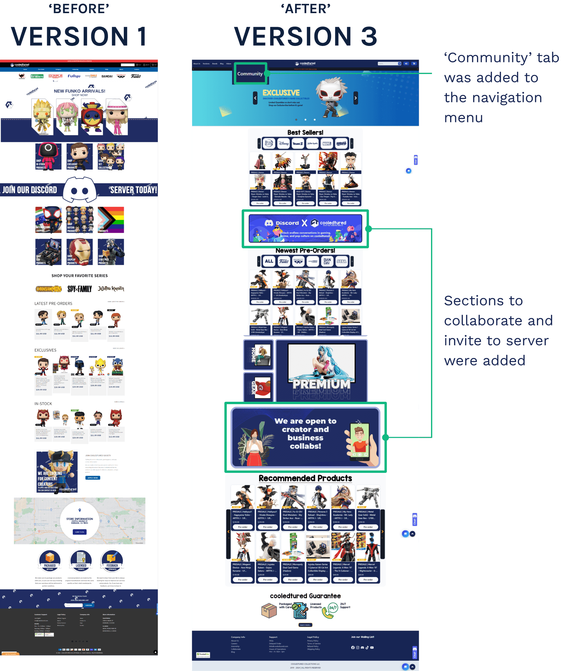
The development team effectively integrated the high-fidelity mockups of the community and internship pages, a scroll to top button, and also included a 'Community' tab in the current navigation menu in Version 3 of its website as of March 2024.
Project Overview
My Contributions
Early Discovery UX Research: User Survey, User Interview, User Personas, SWOT Analysis, Competitor Analysis, Heuristic Evaluation, Stakeholder Interview, Storyboarding, User flows
Information Architecture: Site Map
UX/UI Design: Low/Mid/High-Fidelity Wireframes/Prototypes, rapid prototyping, UI Style Guide
Duration of Project
Internship: Jan 2024 - March 2024
My Role
UI/UX Intern with a focus on UX Research
Solo project
Tools Used
Figma
Contrast Checker: https://webaim.org/resources/contrastchecker/
UX Research Tools: Google User Survey, Zoom, Calendly, Maze
Unsplash
WordPress
Early Discovery UX Research

Methodology
User Survey
44 participants
Conducted digital field research: Recruited participants through various gaming/anime Discord servers, reddit forums, and leveraging personal connections that fit the target demographic
Design Opportunities
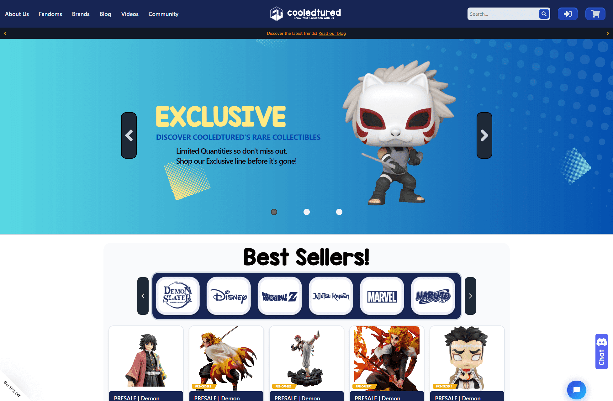
First-Time users felt the website was primarily a Funko Pop store
Users completely missed the intention of the 'Join Discord' banner and overlooked it
Organize sections by priority of information that aligns with company KPIs
Stakeholder Interview
Insights
Interview with their Managing Director
Goals: Wanting to further networks and make new partnerships with artists, anime studios, voice actors, content creators, and independent artists
Expectations: Keep the dark blue as a primary color as it represents the founders' friendship
Design Opportunities
Make more visible to the public the character and how long they've been around to establish more trust
These successes can be showcased on their homepage or on its own pageSince there was no existing UI Style Guide, create one and add styling that expresses the warm, inviting, fun, and friendly nature of cooledtured
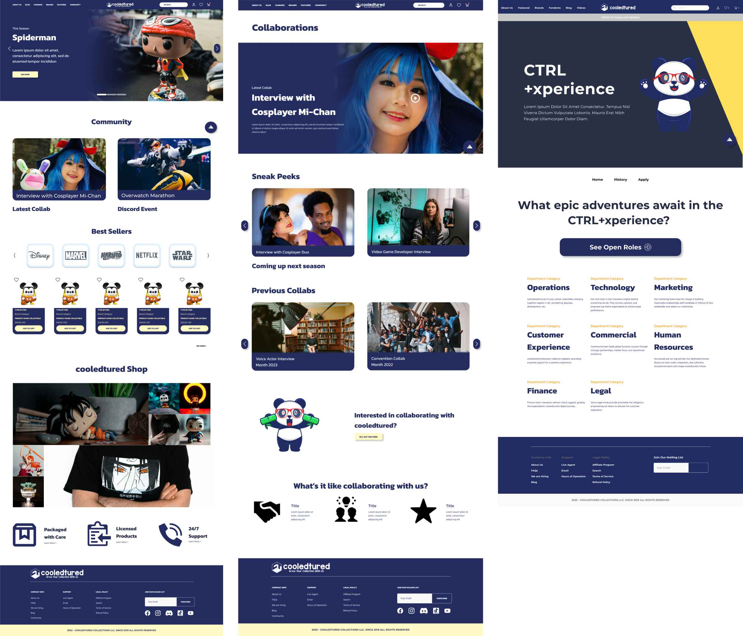
User Persona: Chad & Marlenne May
Images from Unsplash

Design Opportunities
Add a section on the homepage that highlights 'Community' and cooledtured's Discord gaming events
Add a submenu tab that says 'Community'
Heuristic Evaluation
Design Opportunities
Simplify homepage with hierarchy and priority
Logo needs to be clickable and return to homepage
Accessibility recommendations:
Larger icon sizes, minimum 44 x 44 pixels
Put alt text on all images for screen readers
Add 'Scroll to top button' due to long scrolling
Enhancing the Community User Flow
Jack and Marlenne have similar goals on wanting to engage more with cooledtured's community. For this user flow, I focused on Marlenne's user journey of getting involved.

Wireframes
Suggested change: Under the banner, I added a section called 'Community'. This section would feature the latest collaboration and Discord Event from cooledtured.

Usability Testing of User Flow
Goal: Test the idea of adding a Community page and how easily can users find out how to get involved.
Results

My Suggested 'Look and Feel' to the Website Styling
This aesthetic was based on insights from the stakeholder interview.
Based on user interviews, users felt Version 1 of the website felt 'plain' and I felt this was an opportunity to uplift the branding that is characteristic of the company.
Based on insights from the stakeholder interview, cooledtured's personality is approachable, passionate, creative, chill, and professional, hence why the color palette I chose had light pastels that broke from the harsh contrast of simple just white and dark blue of the original website. I chose the heading because it gave a 'game' feel with a professional tone to it.

High-Fidelity Mockups
Putting everything together, the Mid-Fidelity wireframes with the suggested UI Style Guide as well as a suggested Internship page.
*All photography images are from Unsplash.
Developed Site
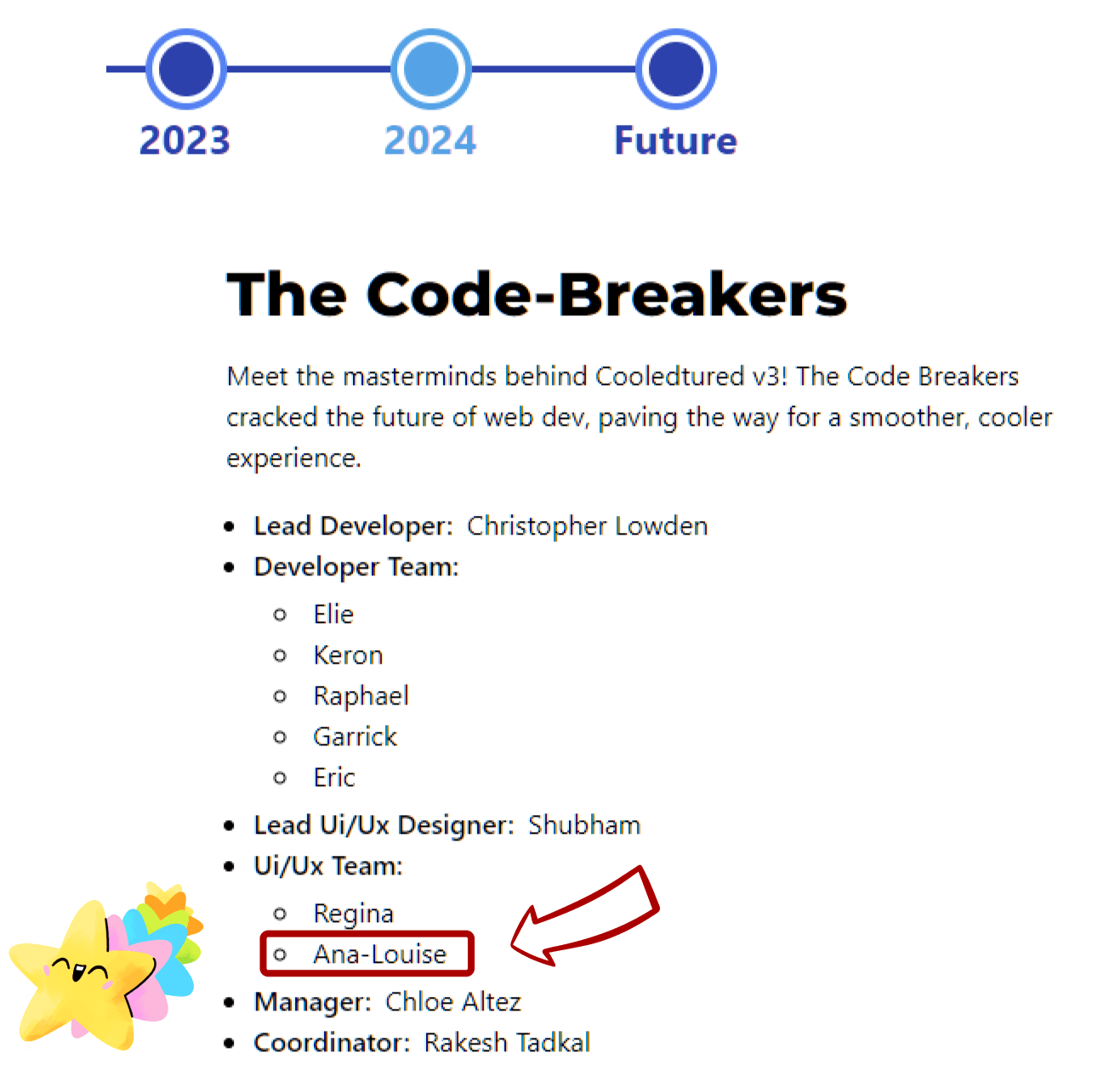
My name is on the website!
Closing
Key Learnings
Key Takeaways
Performing thorough field research to identify target demographics yields valuable insights that can be leveraged by other designers.
Highlighting the unique qualities of a company can help establish a strong presence and foster brand recognition among customers.
Having a dedicated and supportive supervisor greatly contributed to the valuable learning experience gained in the field of UX design during this internship.
Challenges
Navigating multiple components of the website, there was some confusion regarding which version of the website to prioritize for conducting UX Research.
What would I would do for the next project:
Propose the idea of collaborating with our UX Researchers in order to enhance the efficiency of our research collection process. Managing responsibilities ranging from UX Research to UX Design to UI Design within a tight timeframe can be challenging.